Client
Fielding Commercials
About the Project
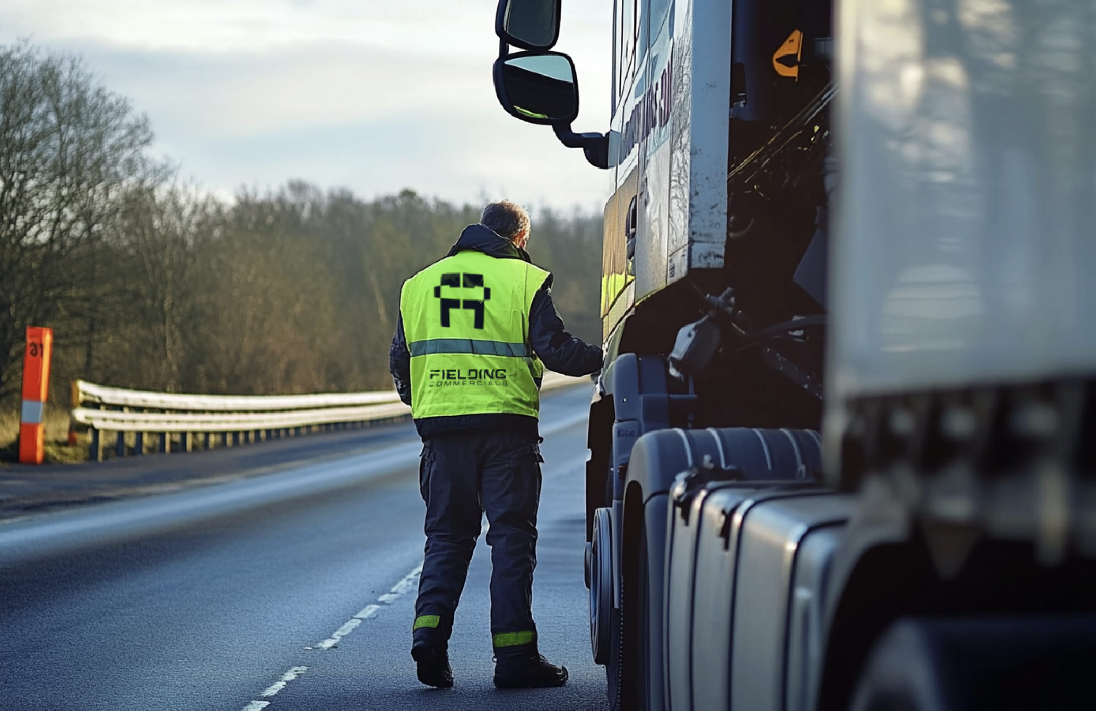
Fielding Commercials is a family-run business built on decades of expertise in truck maintenance and fleet servicing. When tasked with developing their brand identity, the goal was to create a bold, modern, and trustworthy look that reflects both their hands-on approach and their deep-rooted industry experience.
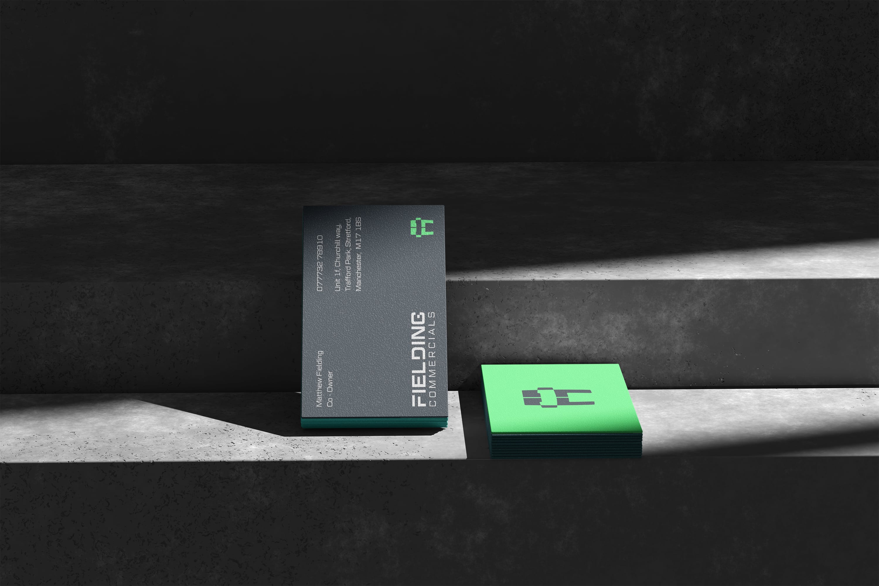
At the heart of the brand is a striking monogram logo, where the "F" is seamlessly integrated into the shape of a truck. This simple yet powerful mark represents both Fielding Commercials and the Fielding brothers who run the business, reinforcing their personal commitment to quality and reliability. The typography is strong and industrial, ensuring legibility and impact across everything from uniforms to fleet graphics.
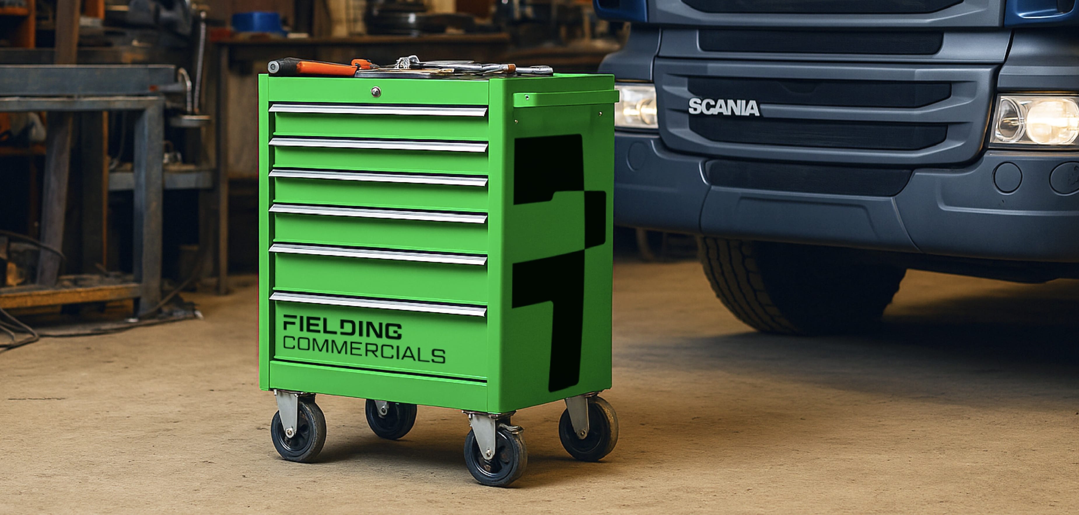
The colour palette was carefully selected to balance professionalism, safety, and industry relevance. Steel Teal and Oil Navy provide a modern yet rugged foundation, while High-Vis Green adds a distinctive, high-visibility highlight—symbolising safety and efficiency, two key factors in the trucking industry. Weld Grey and Fleet White bring contrast and clarity, ensuring adaptability across digital and print applications.
Beyond the logo, I developed a cohesive visual system, including wordmarks, secondary marks, and layout variations designed for signage, uniforms, vehicle branding, and digital assets. The result is a strong, adaptable identity that not only honours the Fielding brothers’ legacy but also sets them apart in the competitive commercial vehicle sector.